Modern
Modern and stylized typography
Unified set
Unified set and adapted to new needs
Balanced image
Balanced image with smooth profiles
”We maintain the structure in a single way, providing modernity, dynamism and digitization as the main brand
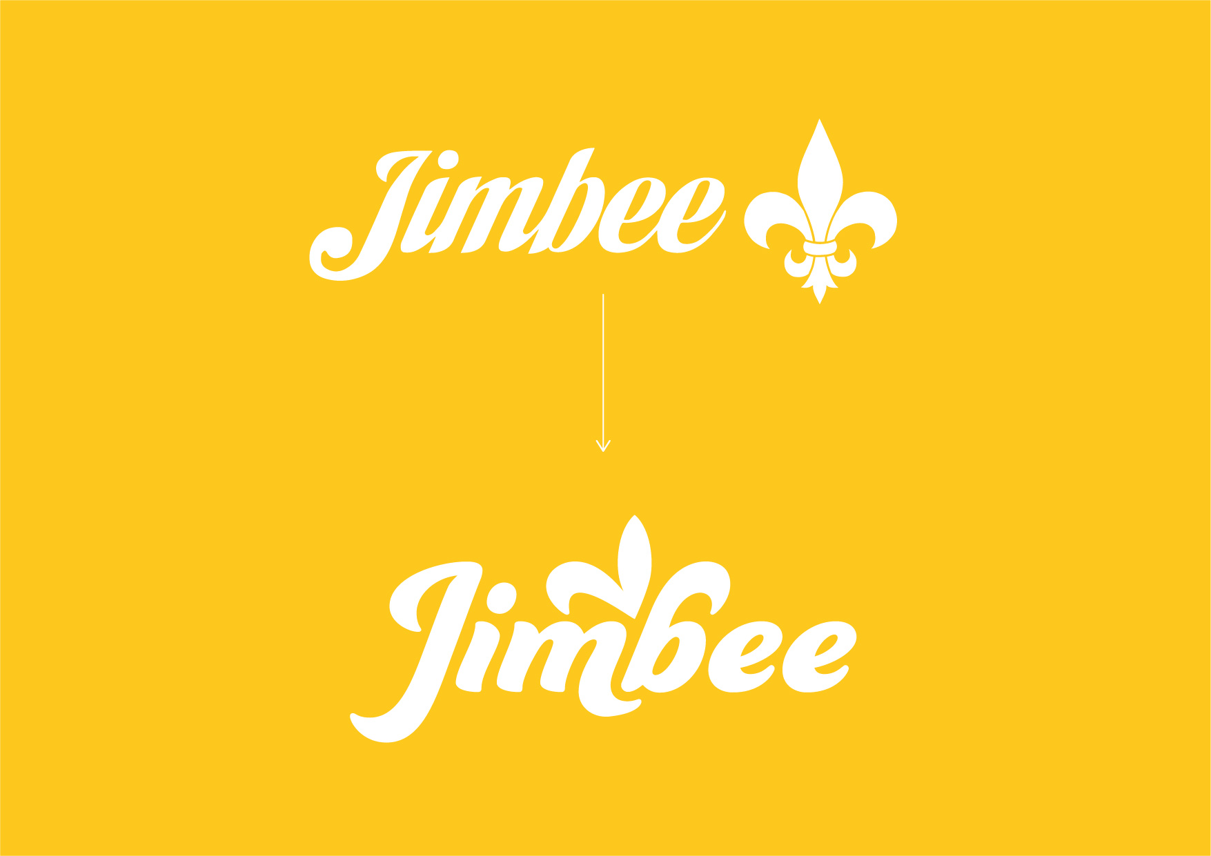
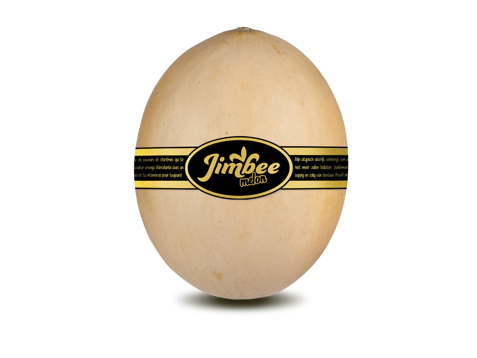
We change our logo but we keep our essence
Unlike its predecessor, which consisted of two parts (font and symbol), the new Jimbee brand will function as a single and homogeneous main element, adapting to different media.
New possibilities and experiences
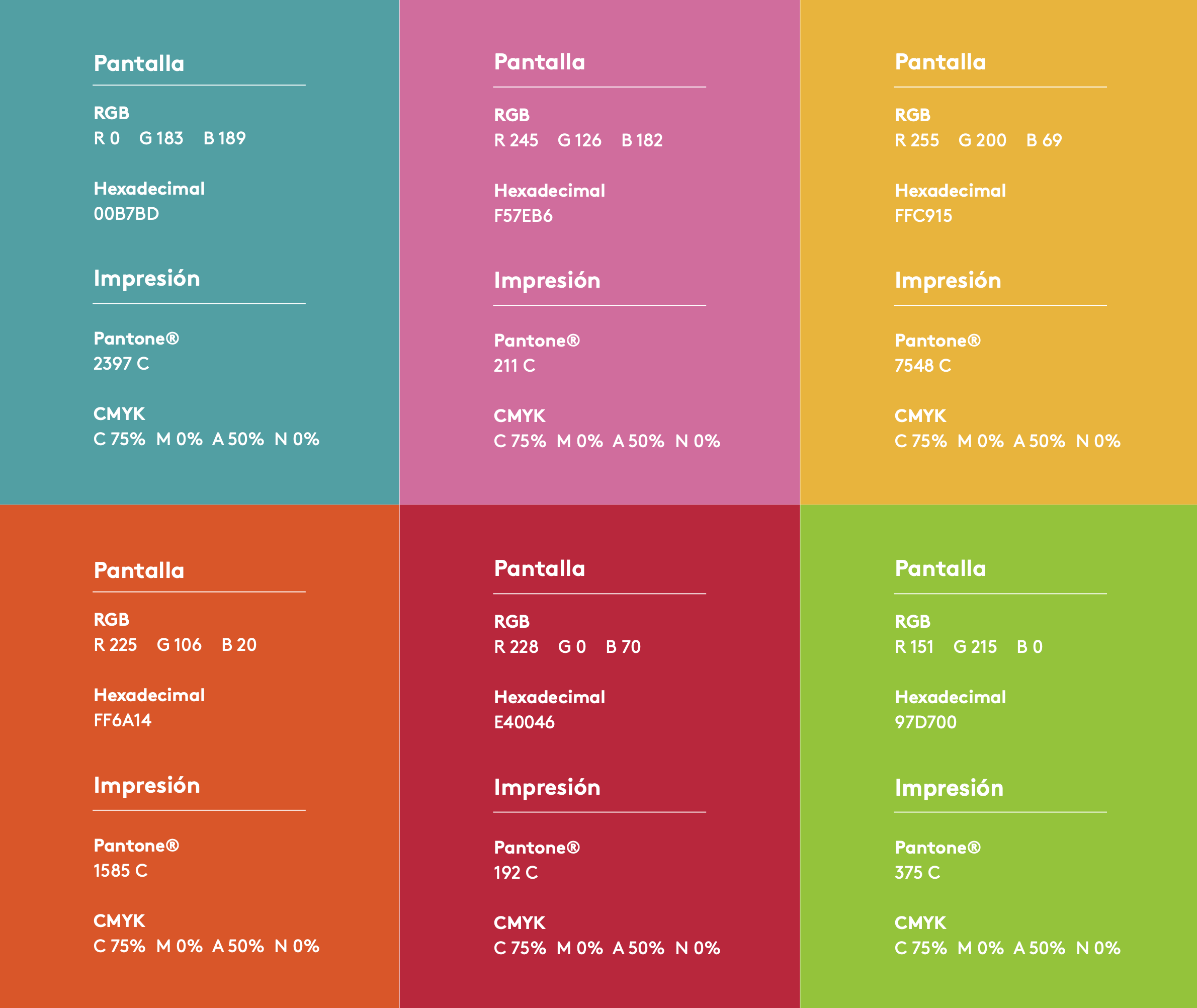
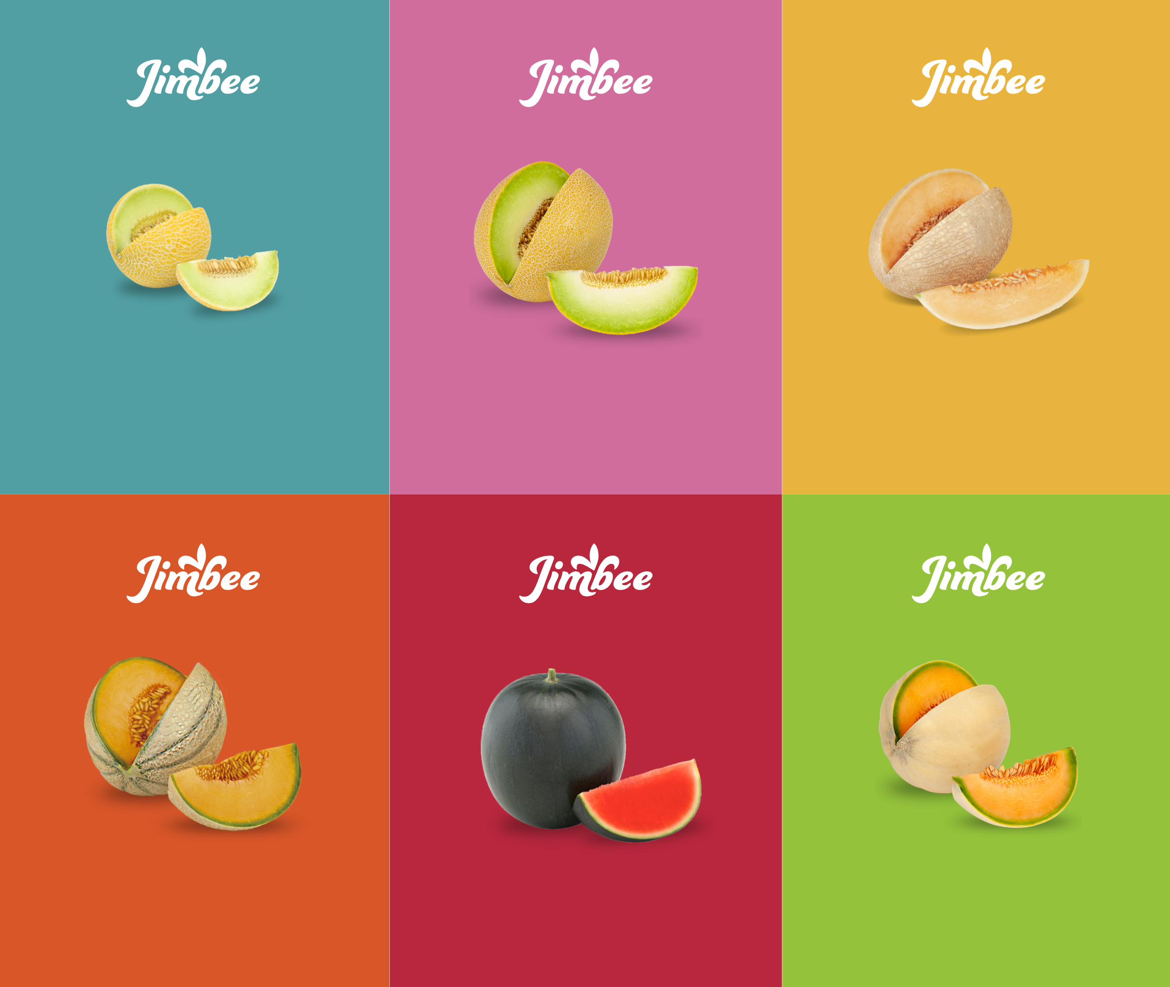
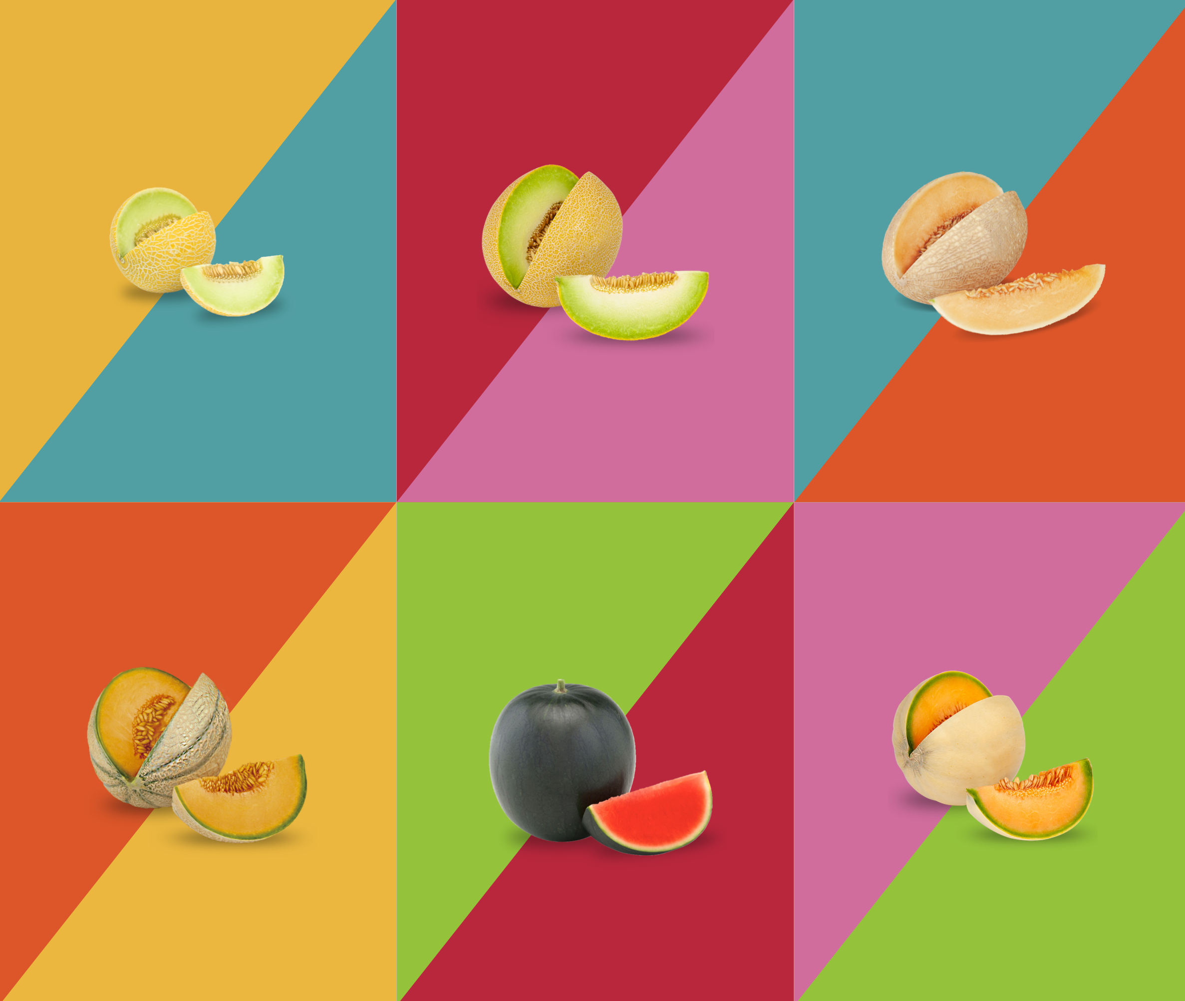
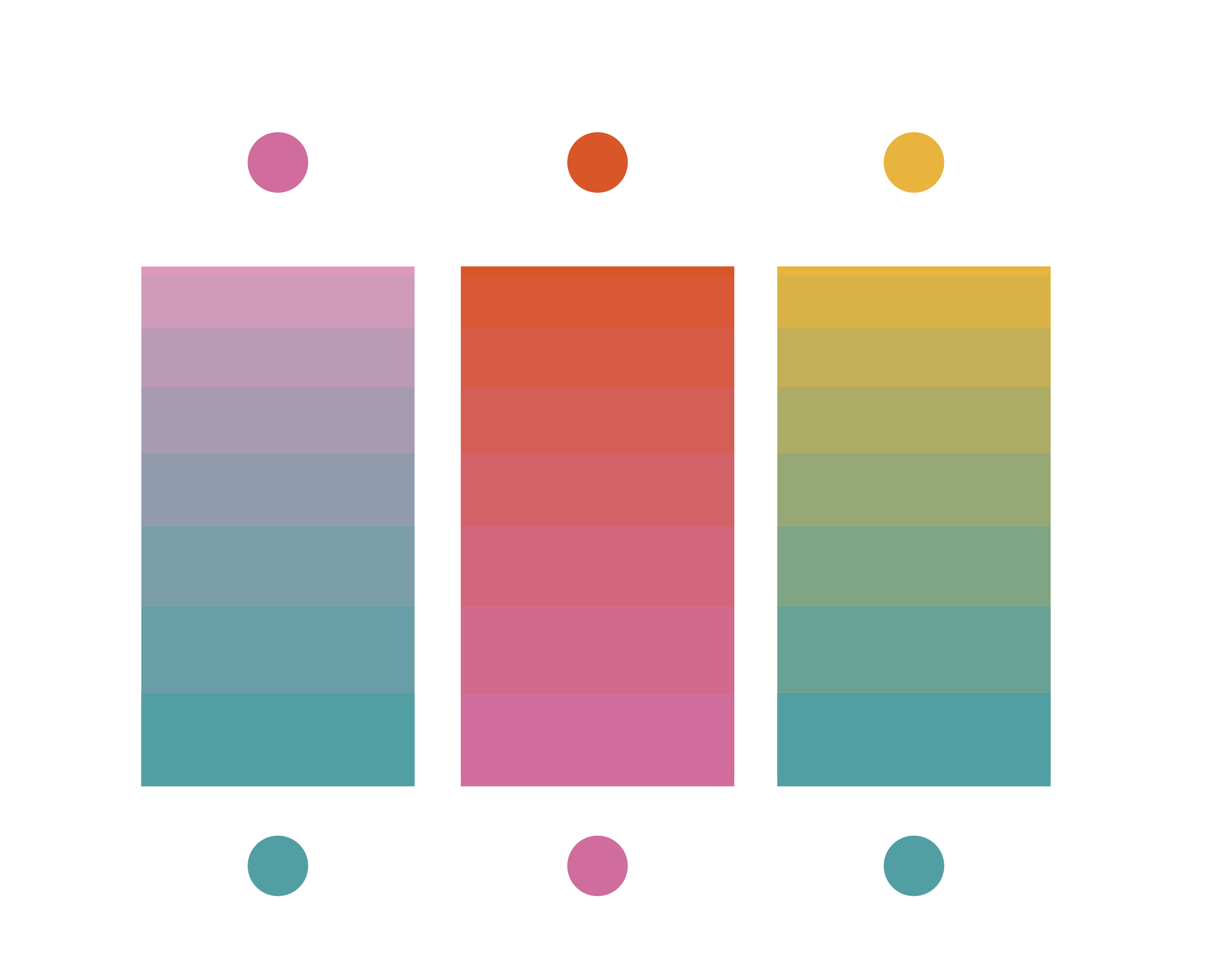
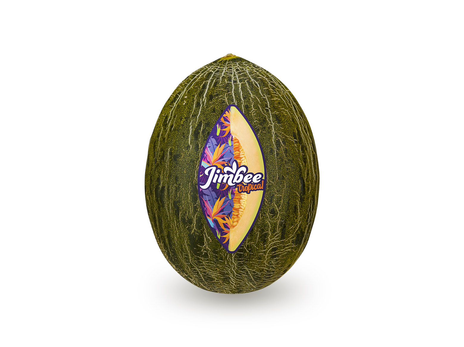
A palette of secondary colors has been created that have been expressly chosen to enhance the brand when necessary. This color palette is designed to work perfectly in cases where the Jimbee brand visually accompanies the different sub-brands such as Lililiup, Waikiki, Le Petit Cupidon, Kisy, Okashi, etc.


